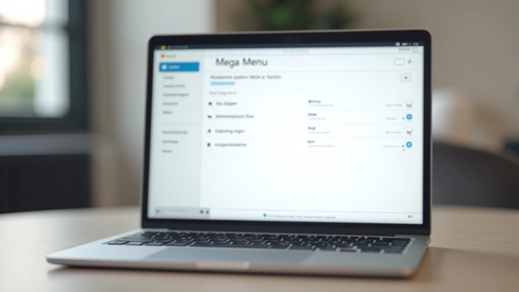
Mega Menus: Organizing Complex Content Architecture
How to design mega menus that don’t overwhelm users. Covers layout patterns, hover states, keyboard navigation, and real examples from major sites.

Why Mega Menus Matter for Content-Rich Sites
When you’ve got hundreds of products, services, or content categories, a standard dropdown menu just doesn’t cut it. Users need to see relationships between items, understand what’s available, and navigate quickly without endless clicking. That’s where mega menus come in.
But here’s the thing — mega menus are tricky. Get them wrong and you’ve created visual chaos that confuses people instead of helping them. The difference between a good mega menu and a bad one often comes down to three core principles: clear organization, smart visual hierarchy, and keyboard accessibility.

The Foundation: Grid-Based Organization
Before you start building, you need a solid structure. Most successful mega menus use a grid approach.
Define Your Categories
Start with 4–8 main categories. More than that and your menu becomes overwhelming. Less than that and you’re probably hiding important content. Look at how companies like Amazon organize their navigation — they use clear, scannable groupings. Each category gets its own column in the mega menu.
Add Subcategories in Columns
Under each main category, create vertical lists of related items. Don’t try to fit everything into rows — columns are more natural for scanning. Users read top to bottom faster than left to right. A typical layout has 3–5 items per column before you need to create a second column.
Include Visual Separators
Use subtle borders, background colors, or whitespace to separate category columns. This helps users understand which items belong together. You don’t need anything fancy — a light gray border or a slightly tinted background is usually enough.

Visual Hierarchy: Making Scannability Work
You could organize everything perfectly, but if it all looks the same, people won’t find what they need. Visual hierarchy is what guides the eye.
Category titles should be bold and larger — usually 14–16px, with a darker color or heavier font weight. Subcategory items sit at 13–14px, in a medium gray. This creates a natural scanning pattern where users see main categories first, then drill down to specific items.
Don’t skip icons. Small icons next to categories help people recognize what they’re looking for without reading every word. A shopping bag icon for products, a briefcase for business solutions — these create instant visual anchors.
Interaction Patterns: Hover, Focus, and Keyboard Navigation
Good mega menus need to work with both mouse and keyboard users. Here’s how to get it right.
Hover States Matter More Than You Think
When someone hovers over a category, the menu should open immediately — no delay. A 0.2-second delay feels instant. Anything longer than 0.5 seconds and users think the site is broken. The entire mega menu panel should appear, not just one column. This prevents the frustration of hovering over the wrong spot and having the menu collapse.
Keyboard Navigation Requires Tab Order Planning
Not everyone uses a mouse. Your mega menu needs to be fully navigable with the Tab key. When someone tabs into a category link, the mega menu opens. The focus indicator should be obvious — usually a colored outline or background highlight. You need to manage the tab order so users can Tab through categories, then Tab through items within each category.
Escape Key Should Close Everything
When the mega menu is open and someone presses Escape, it should close immediately. Focus should return to the menu trigger button. This is standard keyboard behavior and users expect it. It’s also important for mobile users who might be using keyboard accessibility features.

Real Implementation Patterns That Work
Let’s look at how real companies handle mega menus and what makes their approaches effective.
The Category + Featured Pattern
Many e-commerce sites pair their mega menu columns with a featured section on the right. This right column shows promoted products, seasonal items, or key announcements. It’s not just extra space — it’s a strategic placement that drives traffic to high-priority items. The ratio is usually 70% category columns, 30% featured content.
The Column-Based Navigation
Companies like Shopify and Figma use strict column layouts where each column is exactly 200–250px wide. This constraint forces better organization. You can’t just throw items in randomly — you have to be intentional about what goes where. The result? Users find things faster because the menu structure is predictable.
The Flat Hierarchy Alternative
Some modern sites skip deep subcategories entirely. Instead of “Electronics > Computers > Laptops”, they just list everything at one level but use smart visual grouping and icons. This works if you have 40–60 items total. Beyond that, you need hierarchy.
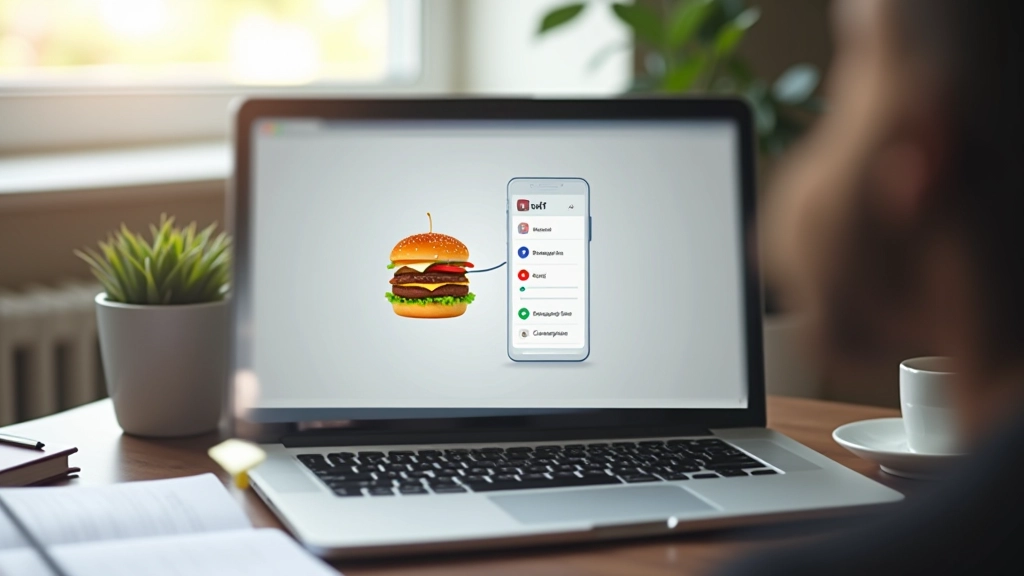
Mobile Considerations: When Mega Menus Become Hamburgers
Mega menus don’t work on small screens. You need a different approach for mobile.
On mobile, your mega menu becomes a hamburger menu or drawer. The good news? You can keep the same category structure. The bad news? You need to handle nested navigation carefully. A typical pattern is to show main categories first, then expand each category when tapped to reveal subcategories.
Don’t just hide the entire mega menu on mobile — adapt it. If your desktop mega menu has 6 main categories with 8 items each, your mobile menu should still have those 6 categories. Users expect consistency. What changes is the presentation, not the information architecture.
Touch targets matter too. On mobile, make sure category buttons and items are at least 4444px. This prevents accidental taps. The spacing between items should be generous — at least 12px. People are using thumbs on small screens, not precise mouse clicks.

Building Mega Menus That Users Actually Like
Good mega menu design isn’t complicated, but it does require thinking through your content structure before you start designing. You need clear categories, smart visual hierarchy, and rock-solid keyboard accessibility. You also need to test with real users — preferably people who aren’t familiar with your site. Watch where they look first. See if they find what they’re looking for. Listen to where they get confused.
The best mega menus fade into the background. Users don’t think about how well-designed they are — they just find what they need quickly and move on. That’s the goal.
Ready to improve your navigation?
Start by auditing your current navigation structure. How many levels deep is it? How many items are at each level? Can you find anything with the Tab key? These questions will reveal where you need to improve.
Explore more navigation patternsImportant Note
This article provides educational information about mega menu design patterns and best practices. Specific implementation details may vary based on your technology stack, user research, and accessibility requirements. Always test your navigation with real users and follow WCAG 2.1 AA accessibility guidelines. Consider hiring a UX researcher to validate your navigation structure before launching to production.
Related Articles
Hamburger Menu vs Visible Navigation: What Actually Works
When to hide your navigation and when to show it. We break down the research and practical considerations…
Read more
Breadcrumb Trails: Wayfinding That Actually Helps
Breadcrumbs aren’t just decorative. Learn when they’re essential, how to structure them properly, and when to skip them…
Read more
Sticky Headers: Balancing Access and Screen Real Estate
Sticky headers keep navigation accessible, but they consume valuable space. We explore the tradeoffs and best practices…
Read more